
Roomix
Interior Design Meets Real-World Budgeting
Figma
Mobile UX
Product Strategy
User Research
AI Integration
Roomix
Interior Design Meets Real-World Budgeting
Figma
Mobile UX
Product Strategy
User Research
AI Integration
Overview
The Challenge:
Users struggle to visualize design outcomes and fear exceeding their budgets, creating a disconnect between planning and purchasing.
The Outcome:
An interior design app that integrates visualization with real-time inventory and budget safeguards.
My Role:
UX/UI Design
User Research
Business Strategy
Strategic Impact
Most interior design tools fail in two areas: they are too complex for the average user, and they lack connection to real-world inventory and prices.
Business Goals:


Build Trust
By showing real prices and "Verified" badges.
Maximize Conversion Through smart product recommendations.
Increase Retention Through stock availability alerts.
User Research & Insights
To understand the core friction in amateur home styling, I conducted a mixed-methods research phase. The target audience focused on tech-savvy millennials (ages 26-35), primarily apartment renters.

Quantitative survey
41 respondents

In-depth interviews
5 participants
80%
Have never used
a 3D design application
Design Insight
The UI cannot be a complex architectural tool. It must replace professional complexity with familiar, gamified simplicity to reduce cognitive load.

Users primarily design when moving apartments, driven by saving money rather than luxury styling.
Design Insight
A real-time budget tracker is not a "nice-to-have" feature; it is the core necessity that must be embedded directly into the visual planning phase.

Users struggle to visualize the final outcome and fail to translate their plans into actual purchases due to high costs and lack of knowledge.
Design Insight
The platform must bridge this gap by connecting instant 3D visualization directly to live, affordable e-commerce inventory.
Meet Rotem - The Creative Digital
“I enjoy designing, but I enjoy the result even more”
Age: 30
Status: Single
Tech Literacy: High
Primary Access: Mobile
Occupation: Digital Marketing Lead
Interior Design Proficiency: Medium+

Background
Rotem rents an apartment in Tel Aviv and treats her home as a dynamic space, making small design updates monthly. Although highly tech-savvy and familiar with AI for inspiration, she is frustrated by complex professional software that isn't built for quick changes. She needs a fast, lightweight platform to visualize new furniture combinations in her existing space before purchasing.
Motivations
Expressing herself creatively through design.
Finding original inspiration and styling solutions.
Combining aesthetics with practicality on a limited budget.
Frustrations & Fears
Overwhelming interfaces and unnecessary technical steps.
Lack of accuracy or scale in spatial simulations.
Falling in love with items that aren't available to purchase.
Mapping the System Logic
Before designing screens, I mapped the system's entities to ensure a seamless flow between inspiration and logistics.
Feature Prioritization
Must-Have
Rotation
2D View
Duplicate Item
In-System Purchase
Search
Edit Dimensions
Add Items
Drag & Drop
Undo Last Action
Create New Project
Delete
3D View
Filter
Accurate Dimensions
Select colors & Textures
AI
Prices
Input room Data
Should-Have
Budget-Based Design
Add Items to Cart
Save Furniture & Styles
Total Cost Display
Price Drop Alerts
Links to Items
Taste-Based Recommendations
Export & Share
Authentic Reviews & Photos
Affordable Alternative
Nice-to-Have
Inventory Status
Taste
Learning
2nd Hand Sales
Before & After
Augmented Reality
Collab Tools
Lighting
Layers
User Profiles
Complementary Item
Import from Photo
Space Scanning
Budget Alerts
Ready-Made Sets
Non-Functional Design alerts
Auto-Fit to Room

Product Strategy Insight: To avoid feature creep, I strictly focused the MVP on the core user friction: Visualization + Cost. Foundational tools like Accurate Dimensions and Prices were prioritized as Must-Haves, while advanced e-commerce loops (like Price Drop Alerts) were pushed to later phases to keep the initial cognitive load low.
System Tree

The Core Logic: Generative AI & Budget Guardrails
I defined two logic flows to address Rotem's conflict: overcoming the "fear of the blank page" while staying grounded in financial reality.
AI Project Generation Flow

Budget Monitoring Flow

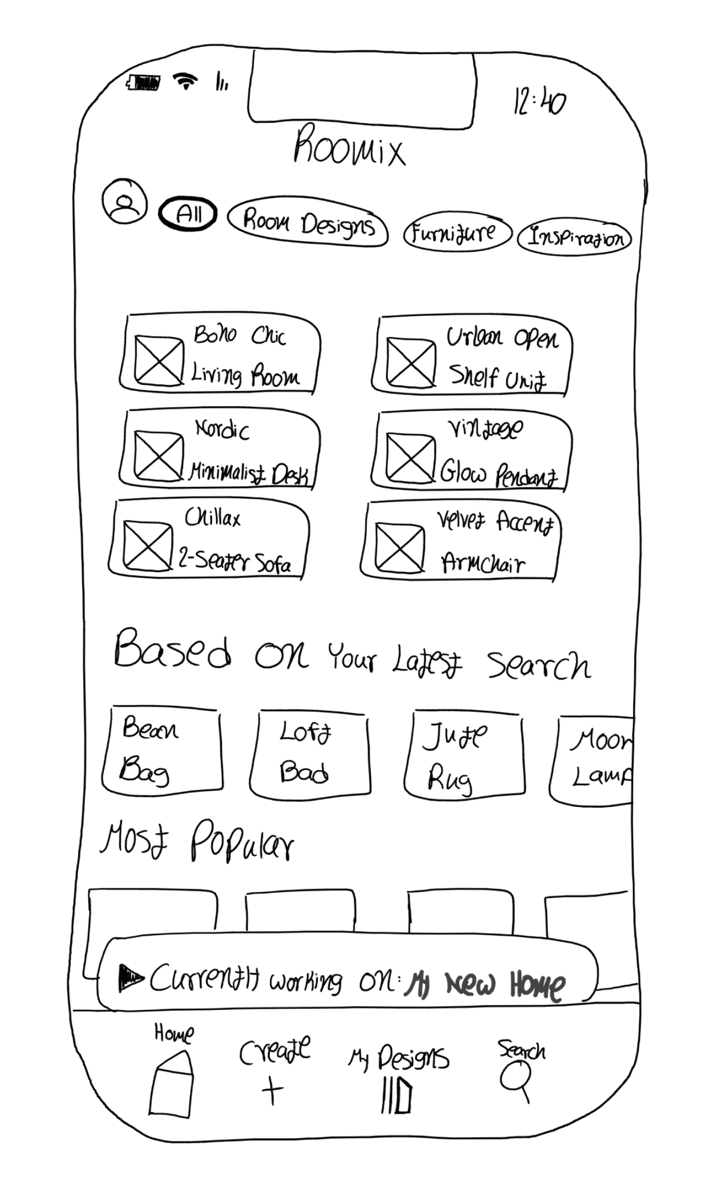
Curating a Room Like a Playlist
The Concept
I designed the interface to minimize the learning curve by mimicking familiar content apps (like Spotify or Netflix). The goal was to allow users to "curate" their home design as easily as they build a music playlist.
UI patterns reduce cognitive load and encourage exploration.
Key Features
Horizontal Scroll: For effortless discovery of items.
Quick Filter Chips: For immediate sorting without deep menus.

Refining the Experience: Before & After
Expanding Touch Targets
Previous State: Users could only click the checkbox itself to select a product.

Fix: The entire image is now clickable for product selection.
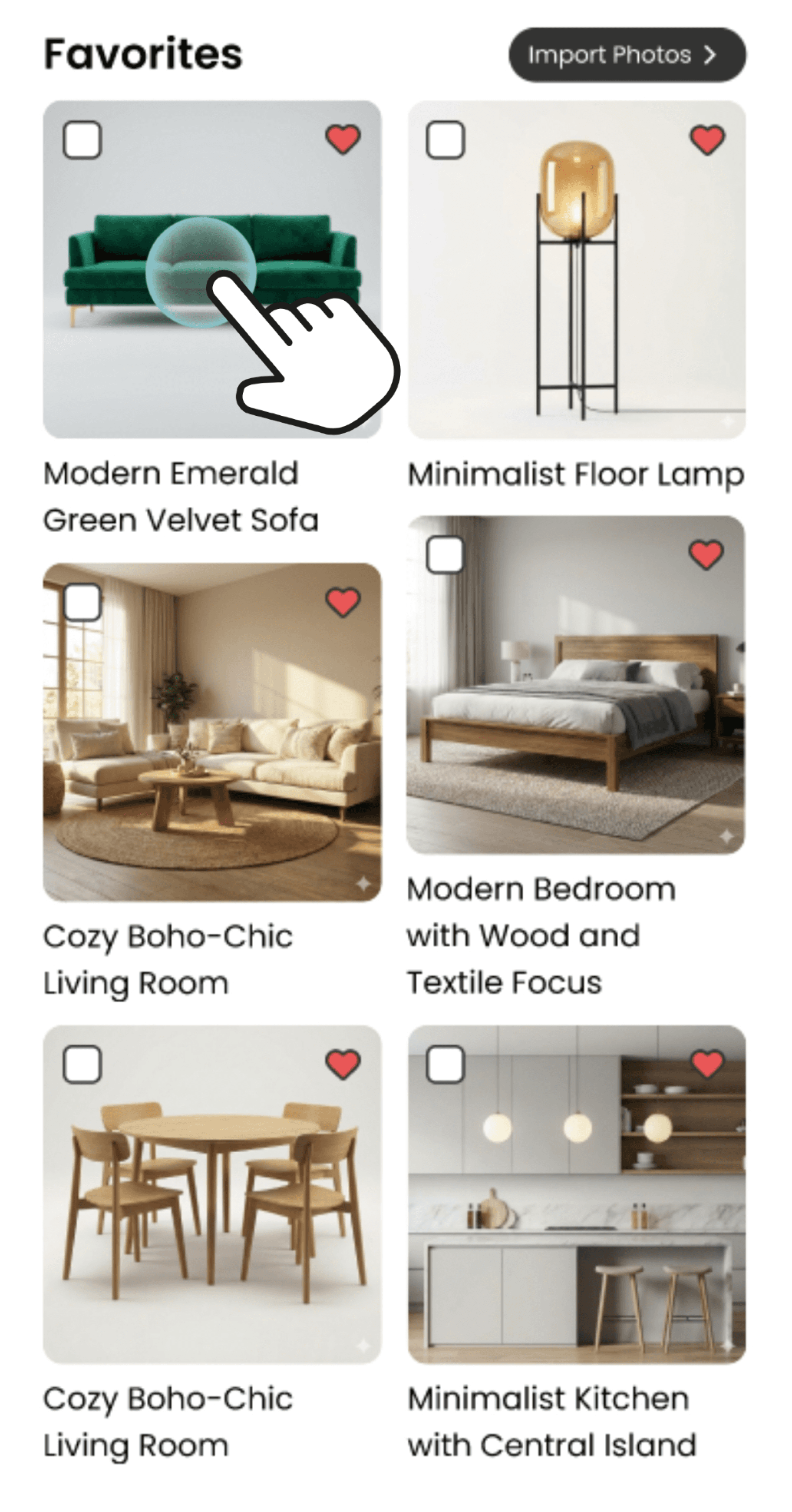
Insight: Usability testing revealed users struggled to tap the small checkbox accurately. Expanding the hit area to the entire card reduced friction and minimized errors.
Visual Recognition Over Text
Previous State: Selection was only possible by clicking the checkbox itself.

Fix: Large, spacious buttons containing illustrative images.

Insight: Users experienced cognitive load when scanning text-heavy lists. Combining text with visual cues leverages 'recognition over recall', significantly speeding up the selection process.
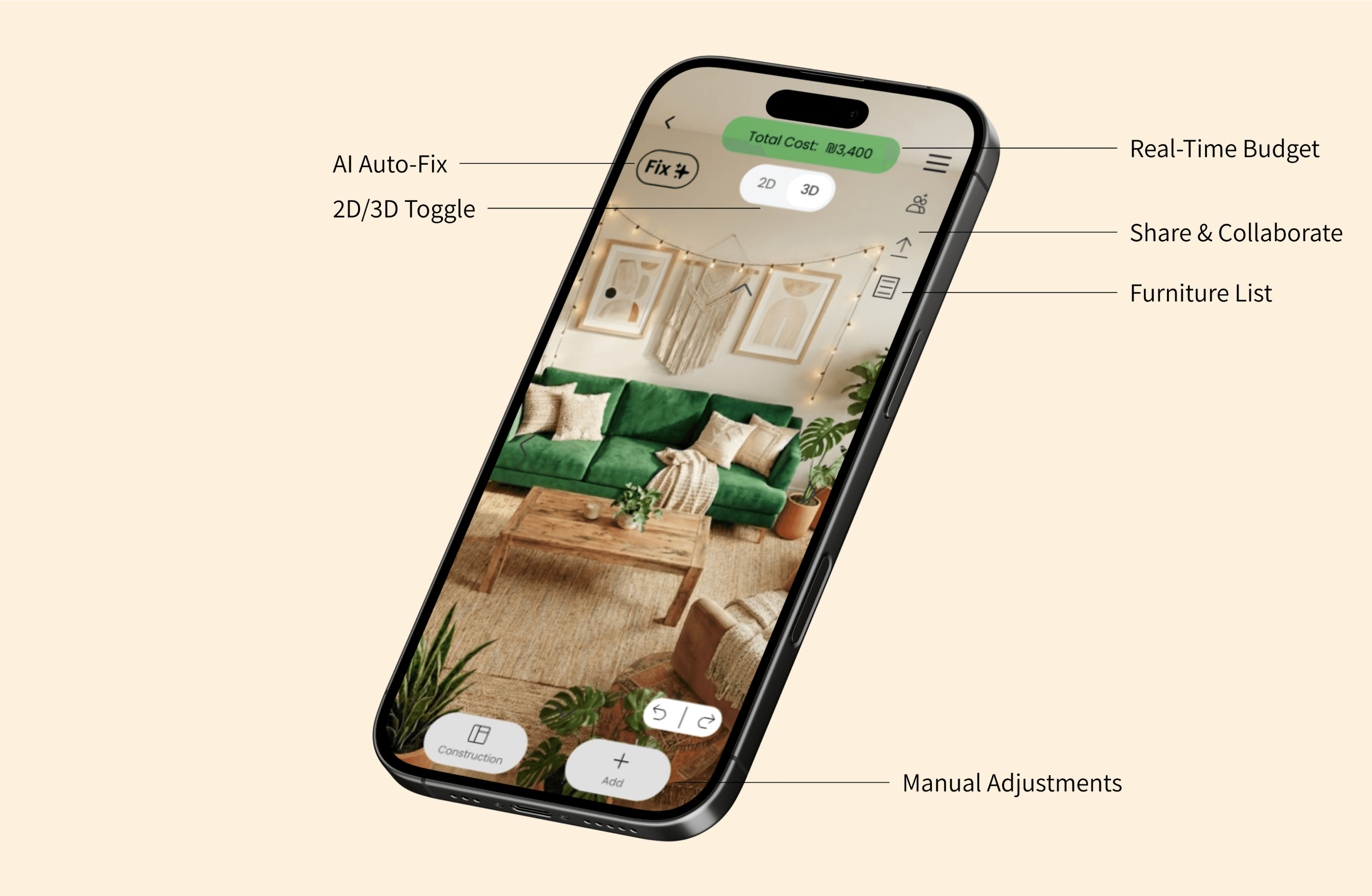
Bringing Roomix to Life: The Final UI
The final interface bridges the gap between professional complexity and everyday usability. By embedding real-time budget tracking directly into the 2D/3D workspace, the design allows users to curate their homes with confidence and zero cognitive overload.
Flow 1: AI-Powered Curation
Overcoming the "Blank Page" Anxiety
Designing a room from scratch can be overwhelming. This flow allows users to leverage Generative AI to instantly visualize spatial arrangements, while maintaining strict control over their budget and stylistic preferences.


1. Multiple Entry Points
Users can choose how to start based on their confidence level. The "Generate with AI" option is highlighted as the primary path for quick inspiration.
2. Grounding AI in Reality
Before generating, users define constraints. Toggles for Max Budget, Color Palette, and Style ensure the AI output is realistic, affordable, and tailored to their taste.


3. Instant Visualization & Tracking
The system generates 2D & 3D floor plans. Notice the persistent Total Cost pill at the top - a crucial guardrail keeping the user instantly informed of the financial impact.
4. Continuous Iteration
AI is a starting point, not the final word. Users retain full creative control to easily swap color palettes or elements without leaving the visual workspace.
Flow 2: Design by Budget
Smart Financial Guardrails
Empowering users to explore design alternatives without the fear of overspending.


1. Establishing Constraints
Users define room dimensions and set a strict budget upfront, ensuring all subsequent design choices are financially grounded.
2. Contextual Actions
Selecting a piece of furniture opens a contextual menu, offering actions like finding alternatives directly within the workspace.
3. Intelligent Alternatives
When a user wants to explore options, the system suggests alternative items that fit within the pre-defined budget, keeping the design process fluid.


4. Staying on Track
Replacing an item instantly updates the overall cost. The green indicator reassures the user they are still within their financial limit.
5. Visual Warnings
If a selected item pushes the total cost over the limit, the budget pill immediately turns red, acting as a clear, non-intrusive warning.
See Roomix in Action
A full walkthrough of the core flows, demonstrating the seamless transition between 2D planning, 3D visualization, and real-time financial control.
Naama Sznaidman
Takeaways & Reflections
Bridging the Gap Between Dream and Receipt The biggest challenge in Roomix was balancing professional-grade visualization with everyday financial reality. My background in data and decision-making helped me realize that a design tool is only as good as its feasibility.
Key Learning: Designing for "recognition over recall" was a game-changer. By replacing complex text menus with visual cues and illustrative buttons, I was able to significantly lower the barrier to entry for amateur designers.
Next Steps: In future iterations (V2), I plan to introduce "Social Curation" - allowing roommates or partners to collaborate on the same space in real-time and vote on furniture choices.
HOME

Roomix
Interior Design Meets Real-World Budgeting
Figma
Mobile UX
Product Strategy
User Research
AI Integration
Overview
The Challenge:
Users struggle to visualize design outcomes and fear exceeding their budgets, creating a disconnect between planning and purchasing.
The Outcome:
An interior design app that integrates visualization with real-time inventory and budget safeguards.
My Role:
UX/UI Design
User Research
Business Strategy
Strategic Impact
Most interior design tools fail in two areas: they are too complex for the average user, and they lack connection to real-world inventory and prices.
Business Goals:

Build Trust
By showing real prices and
"Verified" badges.

Increase Retention
Through stock availability alerts.

Maximize Conversion
Through smart product recommendations.
User Research & Insights
To understand the core friction in amateur home styling, I conducted a mixed-methods research phase. The target audience focused on tech-savvy millennials (ages 26-35), primarily apartment renters.

Quantitative survey
41 respondents

In-depth interviews
5 participants
80%
Have never used
a 3D design application
Design Insight
The UI cannot be a complex architectural tool. It must replace professional complexity with familiar, gamified simplicity to reduce cognitive load.
Users primarily design when moving apartments, driven by saving money rather than luxury styling.
Design Insight
A real-time budget tracker is not a "nice-to-have" feature; it is the core necessity that must be embedded directly into the visual planning phase.
Users struggle to visualize the final outcome and fail to translate their plans into actual purchases due to high costs and lack of knowledge.
Design Insight
The platform must bridge this gap by connecting instant 3D visualization directly to live, affordable e-commerce inventory.
Meet Rotem:
The Creative Digital

“I enjoy designing, but I enjoy the result even more”
Age: 30
Status: Single
Interior Design Proficiency: Medium+
Primary Access: Mobile
Tech Literacy: High
Occupation: Digital Marketing Lead
Background
Rotem rents an apartment in Tel Aviv and treats her home as a dynamic space, making small design updates monthly. Although highly tech-savvy and familiar with AI for inspiration, she is frustrated by complex professional software that isn't built for quick changes. She needs a fast, lightweight platform to visualize new furniture combinations in her existing space before purchasing.
Motivations
Expressing herself creatively through design.
Finding original inspiration and styling solutions.
Combining aesthetics with practicality on a limited budget.
Frustrations & Fears
Overwhelming interfaces and unnecessary technical steps.
Lack of accuracy or scale in spatial simulations.
Falling in love with items that aren't available to purchase.
Mapping the System Logic
Before designing screens, I mapped the system's entities to ensure a seamless flow between inspiration and logistics.
Feature Prioritization
Must-Have
Rotation
2D View
Duplicate Item
In-System Purchase
Search
Edit Dimensions
Add Items
Drag & Drop
Undo Last Action
Create New Project
Delete
3D View
Filter
Accurate Dimensions
Select Colors & Textures
AI
Prices
Input Room Data
Should-Have
Budget-Based Design
Add Items to Cart
Save Furniture & Styles
Total Cost Display
Price Drop Alerts
Links to Items
Taste-Based Recommendations
Export & Share
Authentic Reviews & Photos
Affordable Alternative
Nice-to-Have
Inventory Status
Taste
Learning
2nd Hand Sales
Before & After
Augmented Reality
Collab Tools
Lighting
Layers
User Profiles
Complementary Item
Import from Photo
Space Scanning
Budget Alerts
Ready-Made Sets
Non-Functional design alerts
Auto-Fit to Room

Product Strategy Insight: To avoid feature creep, I strictly focused the MVP on the core user friction: Visualization + Cost. Foundational tools like Accurate Dimensions and Prices were prioritized as Must-Haves, while advanced e-commerce loops (like Price Drop Alerts) were pushed to later phases to keep the initial cognitive load low.
System Tree

The Core Logic: Generative AI & Budget Guardrails
I defined two logic flows to address Rotem's conflict: overcoming the "fear of the blank page" while staying grounded in financial reality.
AI Project Generation Flow

Budget Monitoring Flow

Curating a Room Like a Playlist
The Concept
I designed the interface to minimize the learning curve by mimicking familiar content apps (like Spotify or Netflix). The goal was to allow users to "curate" their home design as easily as they build a music playlist.
UI patterns reduce cognitive load and encourage exploration.
Key Features
Horizontal Scroll: For effortless discovery of items.
Quick Filter Chips: For immediate sorting without deep menus.
Refining the Experience: Before & After
Expanding Touch Targets
Previous State: Users could only click the checkbox itself to select a product.

Fix: The entire image is now clickable for product selection.

Insight: Usability testing revealed users struggled to tap the small checkbox accurately. Expanding the hit area to the entire card reduced friction and minimized errors.
Visual Recognition Over Text
Previous State: Selection was only possible by clicking the checkbox itself.

Fix: Large, spacious buttons containing illustrative images.

Insight: Users experienced cognitive load when scanning text-heavy lists. Combining text with visual cues leverages 'recognition over recall', significantly speeding up the selection process.
Bringing Roomix to Life: The Final UI
The final interface bridges the gap between professional complexity and everyday usability. By embedding real-time budget tracking directly into the 2D/3D workspace, the design allows users to curate their homes with confidence and zero cognitive overload.

Flow 1: AI-Powered Curation
Overcoming the "Blank Page" Anxiety
Designing a room from scratch can be overwhelming. This flow allows users to leverage Generative AI to instantly visualize spatial arrangements, while maintaining strict control over their budget and stylistic preferences.
1. Multiple Entry Points
Users can choose how to start based on their confidence level. The "Generate with AI" option is highlighted as the primary path for quick inspiration.
2. Grounding AI in Reality
Before generating, users define constraints. Toggles for Max Budget, Color Palette, and Style ensure the AI output is realistic, affordable, and tailored to their taste.
3. Instant Visualization & Tracking
The system generates 2D & 3D floor plans. Notice the persistent Total Cost pill at the top - a crucial guardrail keeping the user instantly informed of the financial impact.
4. Continuous Iteration
AI is a starting point, not the final word. Users retain full creative control to easily swap color palettes or elements without leaving the visual workspace.
Flow 2: Design by Budget
Smart Financial Guardrails
Empowering users to explore design alternatives without the fear of overspending.
1. Establishing Constraints
Users define room dimensions and set a strict budget upfront, ensuring all subsequent design choices are financially grounded.
2. Contextual Actions
Selecting a piece of furniture opens a contextual menu, offering actions like finding alternatives directly within the workspace.
3. Intelligent Alternatives
When a user wants to explore options, the system suggests alternative items that fit within the pre-defined budget, keeping the design process fluid.
4. Staying on Track
Replacing an item instantly updates the overall cost. The green indicator reassures the user they are still within their financial limit.
5. Visual Warnings
If a selected item pushes the total cost over the limit, the budget pill immediately turns red, acting as a clear, non-intrusive warning.
Naama Sznaidman
See Roomix in Action
A full walkthrough of the core flows, demonstrating the seamless transition between 2D planning, 3D visualization, and real-time financial control.
Takeaways & Reflections
Bridging the Gap Between Dream and Receipt The biggest challenge in Roomix was balancing professional-grade visualization with everyday financial reality. My background in data and decision-making helped me realize that a design tool is only as good as its feasibility.
Key Learning: Designing for "recognition over recall" was a game-changer. By replacing complex text menus with visual cues and illustrative buttons, I was able to significantly lower the barrier to entry for amateur designers.
Next Steps: In future iterations (V2), I plan to introduce "Social Curation" - allowing roommates or partners to collaborate on the same space in real-time and vote on furniture choices.
HOME